Numbers and pictures
Visualising data
I've always had a visual brain, have a bit of a penchant for reading maps and used to work in television journalism. So I've never felt confined to conveying information by the written word. So it's little surprise that I like the smart use of graphics to illustrate complicated points. I like infographics which usually convey lots of disparate information into a connected flow but also great diagrams, maps and charts that convey a point more powerfully than any spreadsheet ever could. The British Library currently has a small, free exhibition called Beautiful Science - picturing data, inspiring insight. Or to use a term of the moment, "data visualisation". It's not worth a visit in its own right but if you're passing then you may enjoy it (the Georgians exhibition is also fab - I learnt a lot about the origins of much of the popular culture we share today).
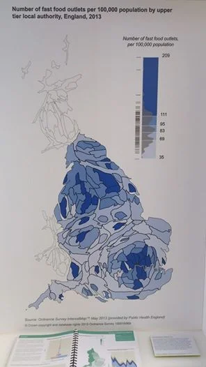
Back at Beautiful Science there were a whole series of really interesting maps, produced for Public Health England by the Ordnance Survey. You're hit with the impression that public health is a postcode lottery in this country. These so-called cartograms, which distort the shape of geographic regions to make their areas proportional to their populations, are used in PHE's annual report. I'd like to ask a good graphic designer to have some fun making them more eye catching for campaign purposes. Wouldn't this diagram of fast food outlet concentrations look more (un)appealing if the unhealthiest areas looked like they were oozing fat whilst the areas with fewer junk food eateries had an appearance which conjured up lean and wholesome food?
More could be done to bring this map to life, but it makes its point well. Londoners are living in fast food hell; Manchester is swimming in oil too, by looks of things.


